酒徒辞典The Drinking Dictionary
以书籍编排探索文字、图形和阅读节奏。
An editorial exploration of type, image and rhythm.
01 / THE IDEA
关于这个项目Behind the work
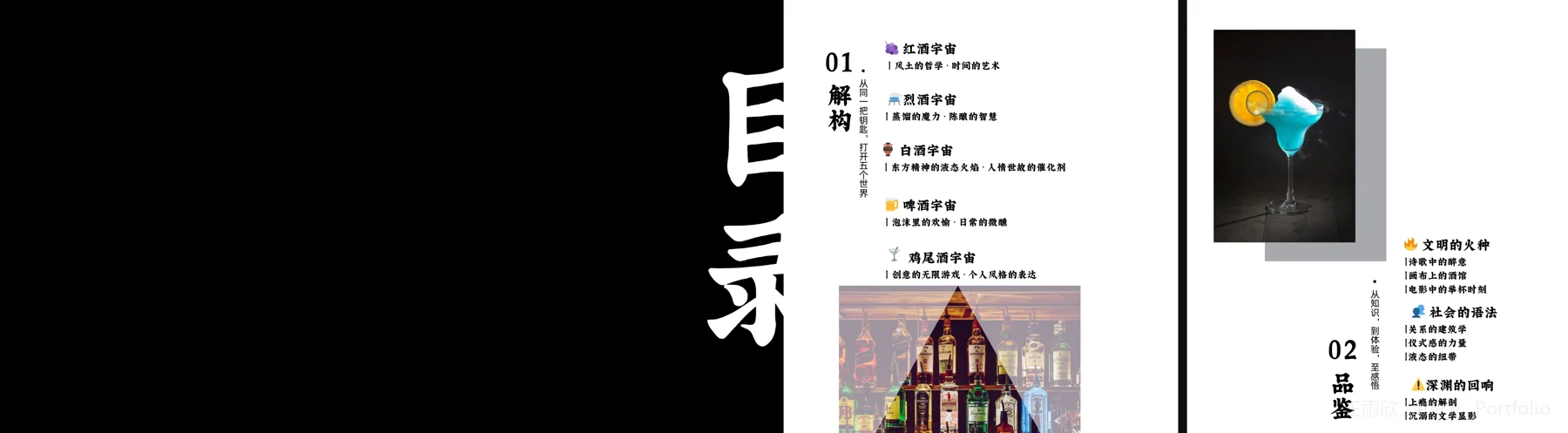
《酒徒辞典》以封面上的彩色瓶形线条开启阅读。原稿目录分为“解构”与“品鉴”:前者列出不同酒类,后者转向艺术、社会与个人体验。这里先看书籍如何组织内容,再完整翻阅现有封面和26个内页跨页,最后回看三个具体的版式选择。以下文字为基于作品画面的设计解读。
Coloured bottle outlines introduce The Drinking Dictionary. Its contents divide the book into two parts: Deconstruction, organised around different drinks, and Appreciation, moving into art, society and personal experience. Explore the structure, browse the cover and all 26 available interior spreads, then revisit three layout decisions. The commentary below is an interpretation of the displayed artwork.
先看目录,再选择阅读入口Start with the contents, then choose a way in
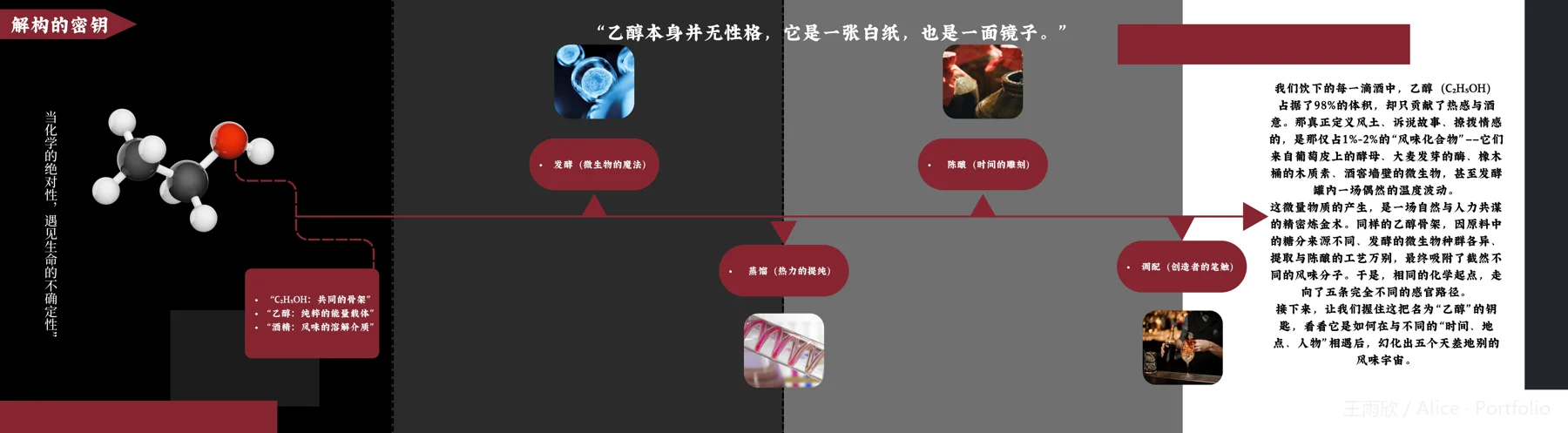
原稿目录以“01 解构”和“02 品鉴”组织内容。下方选取目录、烈酒跨页和艺术跨页作为三个入口;它们是作品导读,不替代原书目录,也不改变完整阅读顺序。The original contents use two headings: 01 Deconstruction and 02 Appreciation. The contents, a spirits spread and an art spread offer three entry points below. These are selected starting points, not a replacement for the original contents or a new reading order.

翻阅这本书Turn the pages
阅读图 01 / 27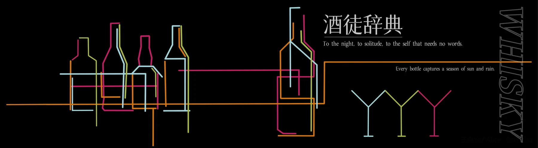

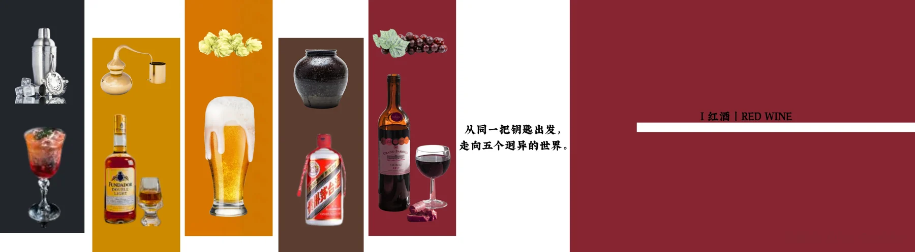
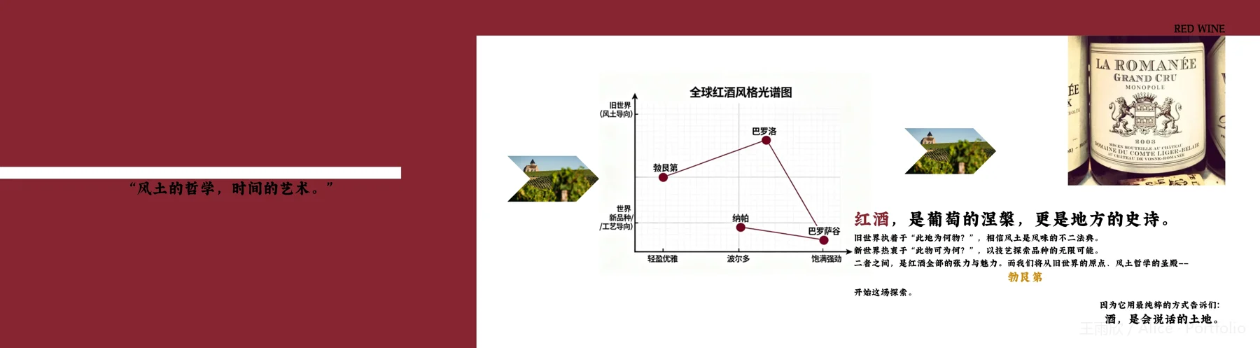
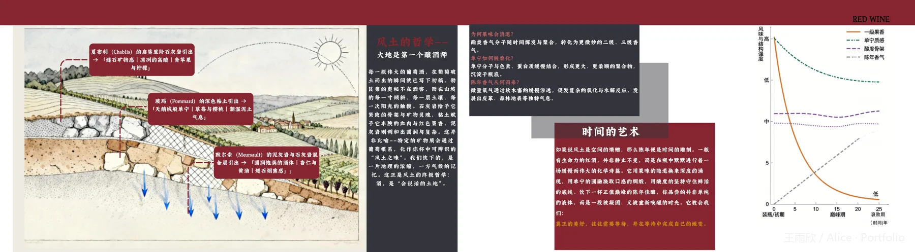

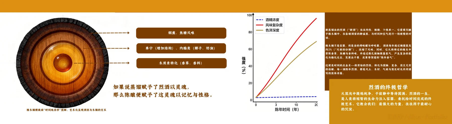
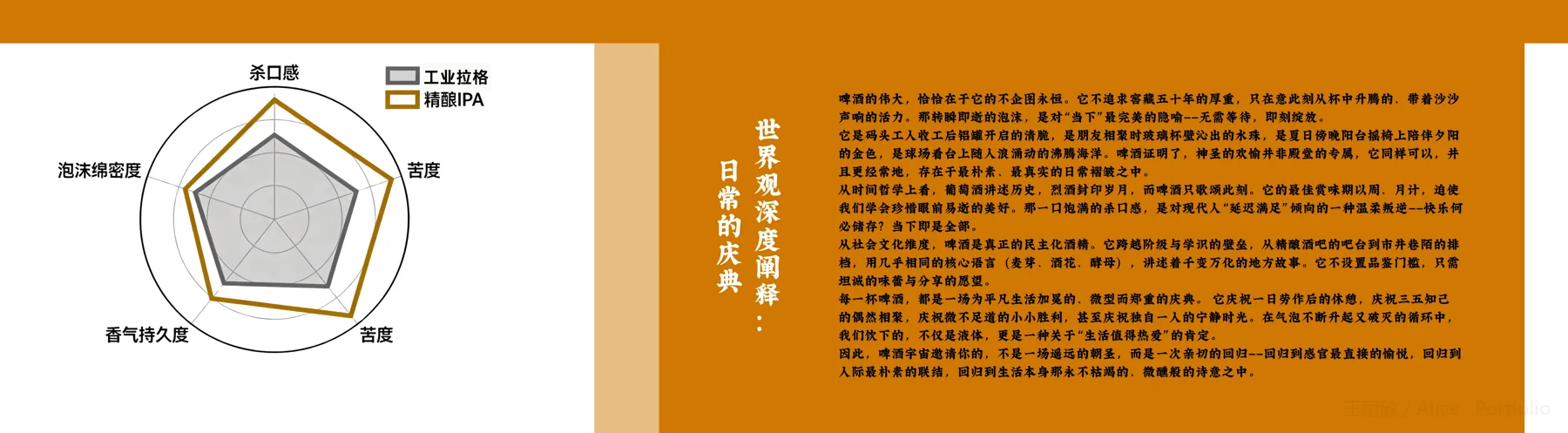
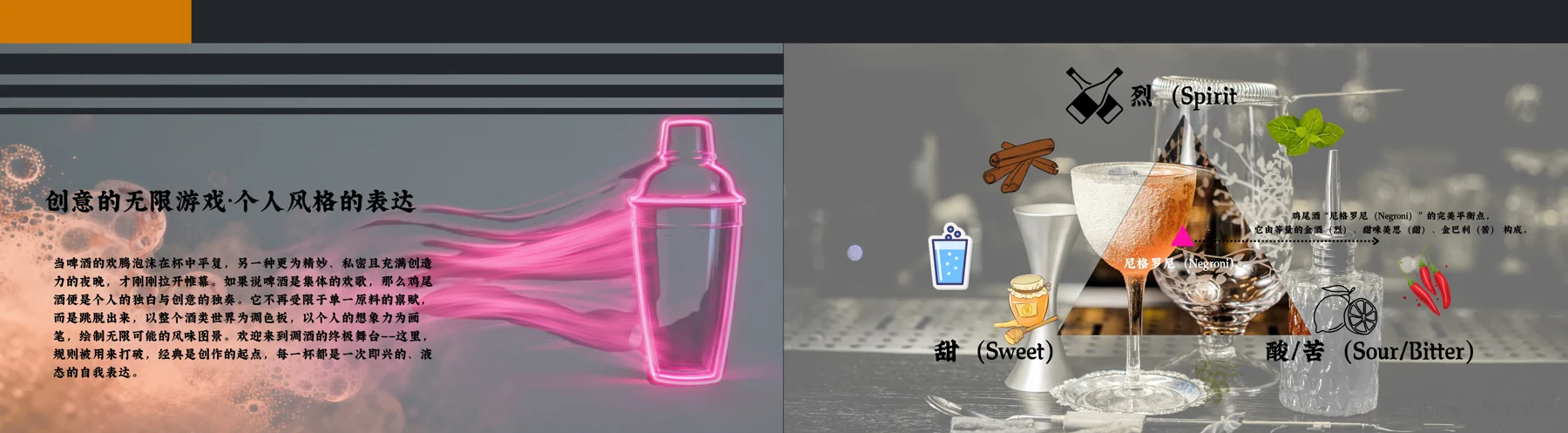
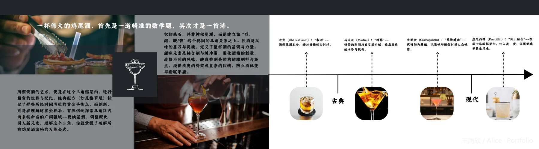
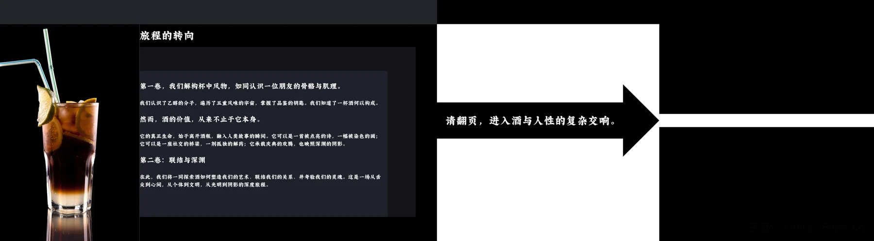
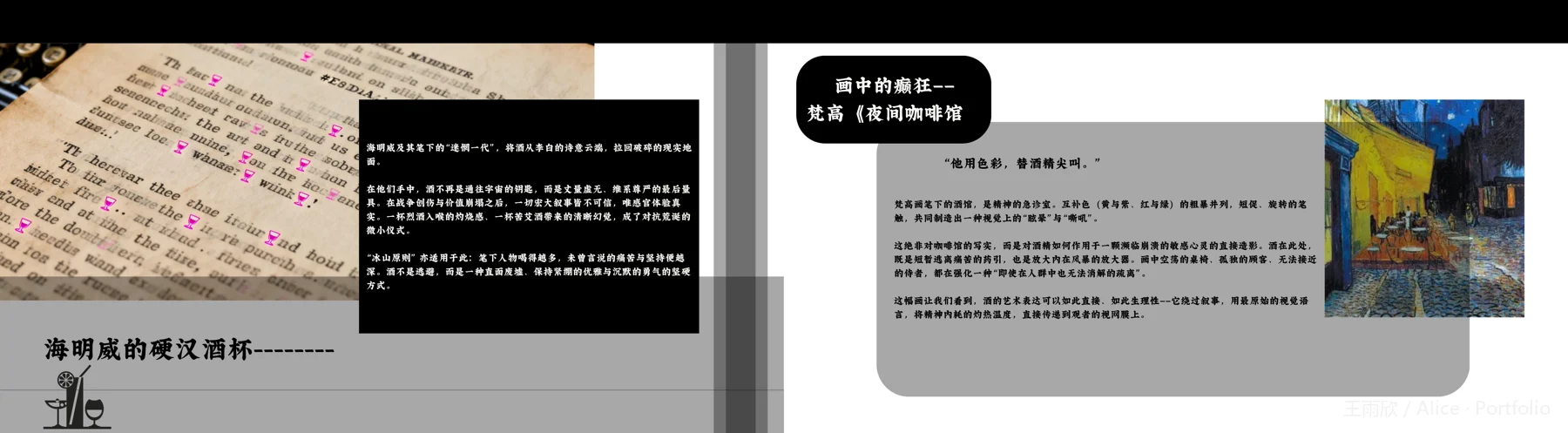


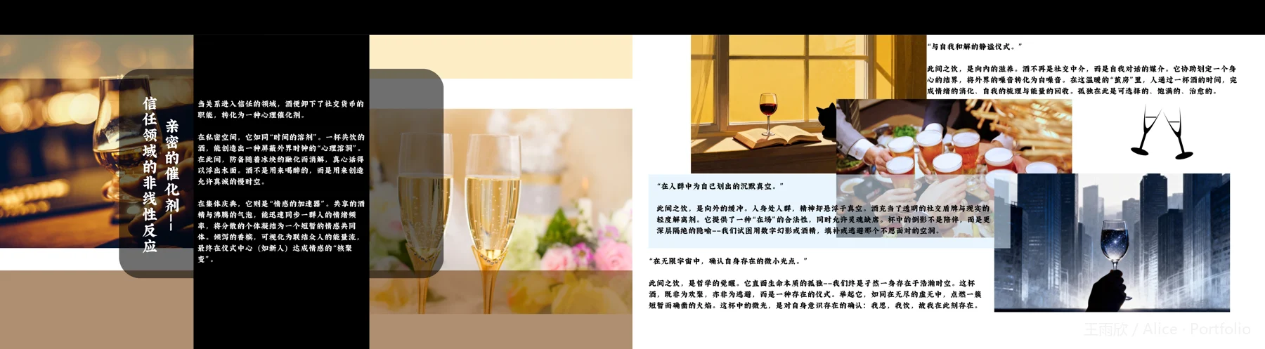
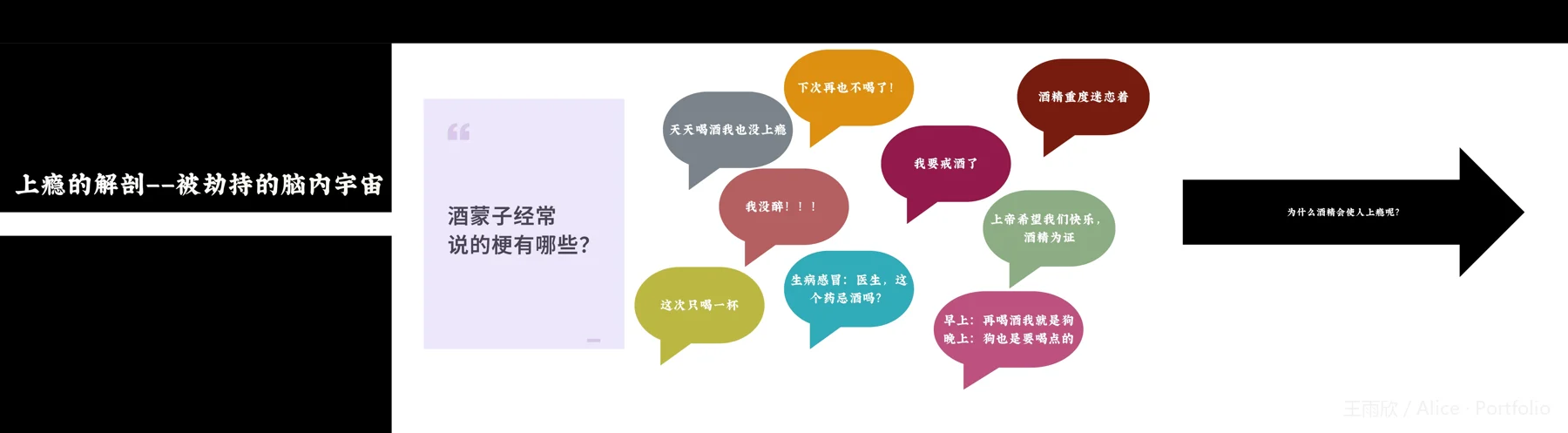
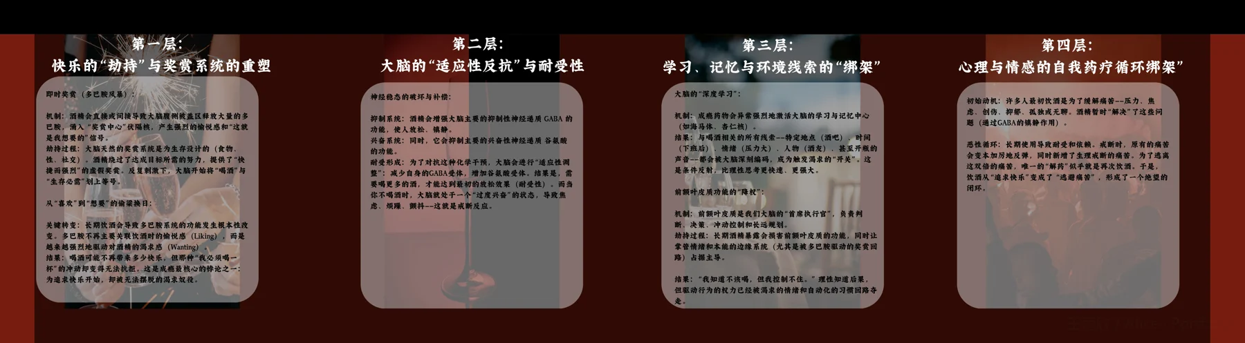
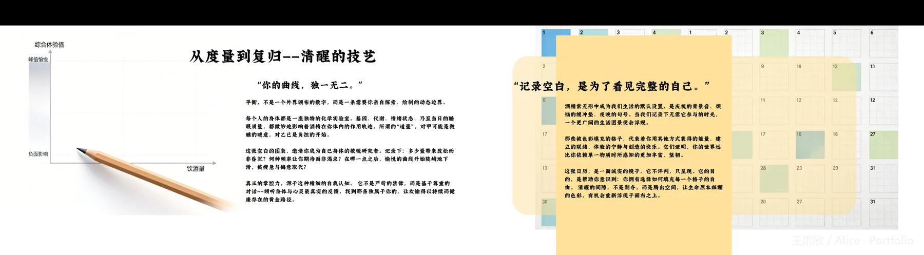
封面与封底
Front and back cover
回看三个版式选择Revisit three layout decisions
设计解读 / Design commentary
让一根线同时成为轮廓与连接Lines that outline and connect
封面以黑底承托青、绿、橙和洋红色线条:竖向折线勾出不同瓶形,横线又穿过瓶身,连接左右画面。右侧书名下的细横线、底部并列的杯形,以及边缘竖排的描边英文,延续了“以线组织画面”的方式。大面积黑色留白让彩色轮廓与浅色书名形成清楚的视觉层级。这种解读来自画面的线条关系,不代表对印刷工艺或作者调研过程的判断。
Cyan, green, orange and magenta lines sit on a black ground. Vertical turns outline different bottles, while horizontal lines cross their bodies and connect the composition. A fine rule below the title, three glass outlines and large outlined lettering along the right edge extend the same linear language. The black space separates the coloured contours from the pale title. This reading concerns the visible composition, not its printing process or the designer’s research.
用重复标签建立扫读节奏Repeated labels create a scanning rhythm
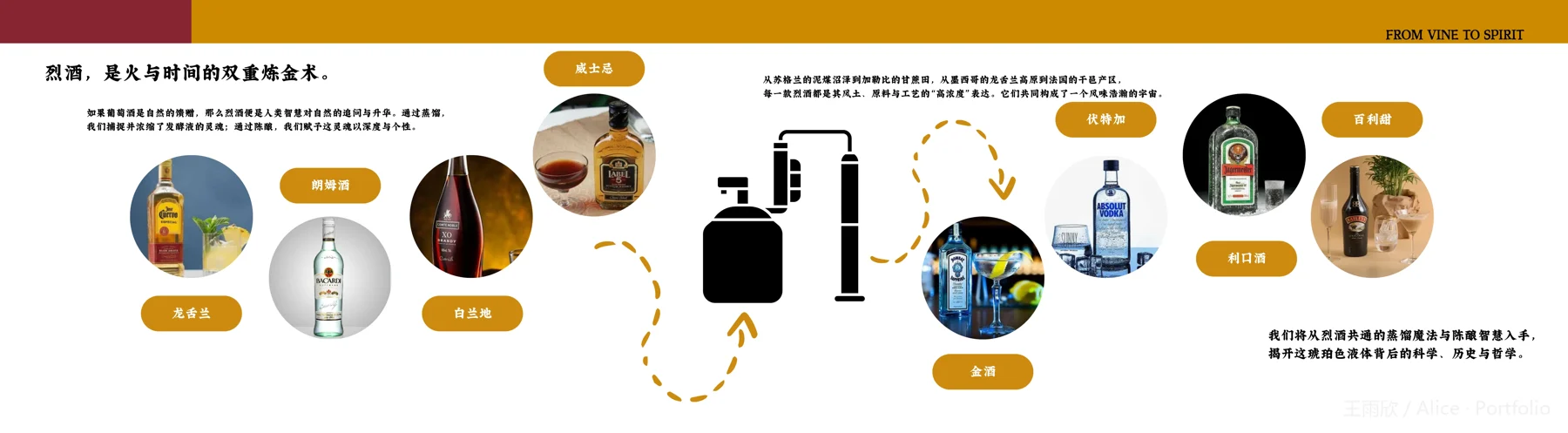
这个烈酒跨页将圆形产品照片与金黄色圆角名称标签成组排列,画面中央放置黑色蒸馏器图示。金黄色虚线箭头在图组之间转折,顶部色带与同色标签把分散的元素联系起来。较大的左上标题先说明主题,小段文字补充解释,读者随后可以沿照片、名称和图示查看内容。这里可核实的是重复形状、颜色和大小建立的信息层级,不是读者理解效率的实测结论。
This spirits spread pairs circular product photographs with rounded gold name labels around a black still illustration. Dashed gold arrows turn between the groups; the top band and matching labels connect otherwise separate elements. A larger heading introduces the topic, with short text blocks supplying context before readers explore the photographs, names and diagram. The visible evidence is a hierarchy built from repeated shapes, colours and scale, not a measured improvement in comprehension.
让章节标识与正文各有空间Separate space for chapter and text
“酒与艺术——文明的火种”以白字落在左侧黑色区域,一道白色横带将它与右侧浅色阅读区连接。右侧依次安排文章标题、较短的正文段落,以及月亮和水墨人物图像;文字与图像之间保留了明显空白。与前面的酒类图解相比,这一跨页减少了密集的分类标签,用明暗分区与留白提示内容转向。章节题、文章题与正文的大小差异,也让读者能区分两层标题和具体叙述。
The chapter heading appears in white on a black area at the left, linked by a white horizontal band to the pale reading area. On the right, an article heading and short paragraphs sit alongside a moon and an ink-style figure, with visible space between text and image. Compared with the earlier drinks diagram, fewer classification labels and a stronger light–dark division signal a change of subject. Differences in type size distinguish the chapter heading, article heading and body text.